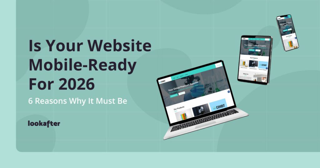
Home > Empowering Tips > Is Your Website Mobile-Ready for 2026?
It’s 2026 — and if your business website still isn’t mobile-friendly, you’re starting the year at a disadvantage.
Your website is no longer just a digital brochure — it’s often the first interaction potential customers have with your brand — and most of them are visiting from a smartphone.
If your site frustrates them, they’ll bounce — and they likely won’t return.
Here’s why having a non-mobile-responsive website is a critical mistake in 2026 — and how it’s hurting your business.
Table of Contents
- 1. The Majority of Web Traffic Comes from Mobile Devices
- 2. Google Ranks Mobile-Friendly Sites Higher
- 3. A Non-Mobile-Friendly Site Hurts Your Brand’s Credibility
- 4. Mobile Users Expect a Seamless Experience
- 5. A Poor Mobile Experience Costs You Money
- 6. Social Media & Ads Drive Mobile Traffic
- How to Fix It: Make Your Website Mobile Responsive
1. The Majority of Web Traffic Comes from Mobile Devices
As of late 2025, nearly 65% of global web traffic comes from smartphones and tablets. If your website isn’t optimized for mobile, you’re turning away more than half of your potential audience.
A poor mobile experience means:
- Slow loading times
- Misaligned buttons and hard-to-read text
- Frustrating zooming and scrolling
The result? Visitors leave within seconds — and go straight to your competitor.
2. Google Ranks Mobile-Friendly Sites Higher
Google has used mobile-first indexing since 2016, but by now it’s the default — meaning it primarily crawls and ranks the mobile version of your site.
If your website isn’t mobile-optimized:
- Your search rankings suffer
- You lose visibility in search results
- Competitors with mobile-friendly sites outrank you
Bottom line: If Google can’t easily read your mobile site, neither can your customers.
3. A Non-Mobile-Friendly Site Hurts Your Brand’s Credibility
First impressions matter — especially online. Research shows that 75% of users judge a business’ credibility based on its design and performance.
If your site looks outdated, loads slowly, or breaks on mobile:
- Customers assume your business is unprofessional or outdated.
- They distrust your brand before even exploring your products.
- They’ll choose a competitor with a polished, mobile-friendly site.
4. Mobile Users Expect a Seamless Experience
Modern consumers demand speed and convenience. If they have to:
- Pinch-to-zoom to read content
- Struggle to click tiny buttons
- Wait too long for pages to load
…they’ll bounce straight to a competitor’s site that works smoothly on their phone. And they won’t give second chances.
5. A Poor Mobile Experience Costs You Money
This isn’t just about looks — it affects your bottom line. Studies show:
- 53% of mobile users abandon a site if it takes more than 3 seconds to load.
- 67% of users are more likely to buy from a mobile-friendly site.
If your checkout process isn’t mobile-optimized, you’re losing sales when the customer is ready to buy.
6. Social Media & Ads Drive Mobile Traffic
Most traffic from platforms like Facebook, Instagram, and TikTok comes via mobile.
If you’re running ads and sending traffic to a site that isn’t mobile-friendly, you’re wasting your marketing budget on users who won’t stick around.
How to Fix It: Make Your Website Mobile Responsive
The solution is simple — ensure your website is mobile-responsive. Here’s how:
- Test Your Website: Use Google Lighthouse to check how your site performs.
- Adopt a Responsive Design: Ensure your website automatically adjusts to different screen sizes.
- Optimize Loading Speed: Compress images, minimize code, and use caching to improve performance.
- Simplify Navigation: Make menus easy to access and clickable without frustration.
- Regularly Update Your Website: Ensure ongoing improvements to keep up with best practices.
Need help with making your website mobile-responsive? Our Web Design Service specializes in creating modern, responsive websites that provide seamless experiences across all devices. Whether you need a one-page HTML site or a WordPress website, we can help optimize your website for both mobile and desktop users.
Start 2026 with a better website. Contact us today to get started!